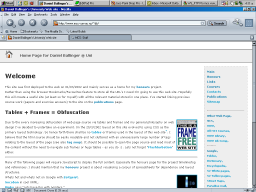
Examples of stylesheet switching
"Never offend people with style when you can offend them with substance." -Sam Brown
Style Gallery
The following are examples of how my webpages rendered using Mozilla.
Results will vary depending on you particular browser and how standards complient it is. Note that Internet Explorer is in a world of its own when is comes to css support. IE5/Windows and IE5.5/Windows need special fix-ups to make them display like conforming CSS user agents
Clicking the  to the right of each picture will change the style (if your browser supports javascript based changes).
Colour Switching and mouse over buttons


Parts of these styles are based on work by Wayne D. Fields of Illusive Design - such as some of the artwork. I've completely redone the layout and mouse over encodings using style sheets.
Boxy


Some source is from Bluerobot. The box design comes from http://www.glish.com/css/noah.asp and is based on a design by Noah Grey. The third style sheet is based on content found at the House of style. The forth style is based on Manageability.
Mouse over text menus


Credits here go to Eric Meyer with the following pages: popups and complexspiral
University Styles


Err.. Its a complete ripoff of the VUW:MCS website with a touch of fish added - no big secret there.
Static Menus

 ,
,


Some stuff based on Eric Meyers styles. But the static menu is all mine :) . Updated this so it only needs the following code:
@import url("origonal.css");

div#Menu {position: fixed;} /* This causes the menu to not scroll with the rest of the page. */
Static Backgrounds


Credit again to Eric Meyer for complexspiral cascading stylesheet. Can't remember the authors of the origonal worms of xfiles images.
Alpha Effect Backgrounds


Inspired by Eric Meyer's complexspiral cascading stylesheet. I've tried to improve on the technique by using alpha effects in the stylesheets, such as
<style>
I still need to figure out how to apply the alpha effect just to the background (not the text or any other elements).
filter:alpha(opacity=100); /* IE */
-moz-opacity:1.0; /* Netscape/Mozilla */
</style>
No Frills


These simple styles provide bare bones positioning of the Menu and Content divs. All other elements should be using your browsers defaults. One benefit of this style is that it will work better with any user defined styles. The second style shows a entirely new center position for the menu.
Center Menu


Extending the basic format of the no frills center layout these styles mimic the layout of the WinAmp site. With the seconds styles colours following the style from here.
Microsoft Word


If you don't know what this is surposed to look like then you either have no experience in computers or a extreme dislike of Microsoft. The idea was inspired by http://www.mvps.org/word/.
More Boxes


The idea was inspired by (but not copied from for legal reasons) http://texturizer.net/firebird/.
Green Terminal Screen
Links
Cascading Style Sheets, Promise vs. Reality, and a Look to the Future
Box Model Hack
House of Style
CSS Tableless Web Sites + CSS Resources
Styling <hr>
Image and Txt Scaling
Implementing style sheet switchers
